Redefining what’s possible - one connection at a time.
Sector
Our value
Illustration
Motion design
Sonic branding
The Challenge
Telkom has long stood as a symbol of South African connection and progress – a brand woven into our national story. But even icons need to evolve. Over time, Telkom’s identity had fragmented across platforms, its assets diluted, and its distinctiveness softened into category noise. To stay relevant in a rapidly changing world, Telkom needed to reassert its role — not by reinventing itself, but by evolving with purpose.
Rooted in the positioning of “Possible begins here”, Telkom’s existing brand assets were elevated into a living design system. Dynamic, adaptable, and built for a digital, omni-channel world.
CREDITS: Brand strategy – Black Swan Advertising, Motion Design – Marco Polo Studios. Illustration – Fresh Helga. Sonic branding – FineTune Studios.
Activating an icon
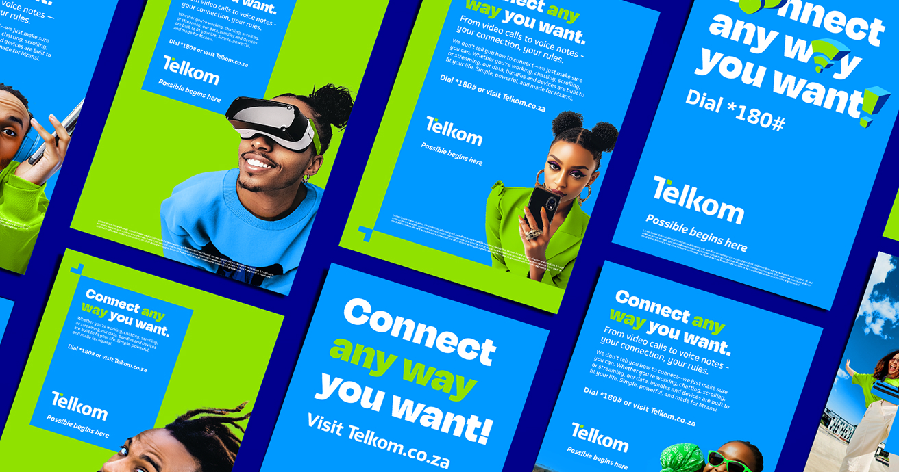
At the heart of the brand refresh is the Dynamic T: the face of the brand, and the engine of the system. Instantly recognisable and highly flexible, it activates across culture, customer interactions and tactical touchpoints.

Human by design
Photography captures everyday moments of possibility. Bold, confident, and authentic, it reflects the optimism, ambition, and ingenuity of South Africans.


Typography that speaks
Built to complement Telkom’s bespoke typeface, a bolder, more expressive typographic system gives the brand a confident voice, even without imagery. It balances impact and clarity across every platform.

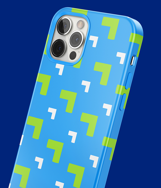
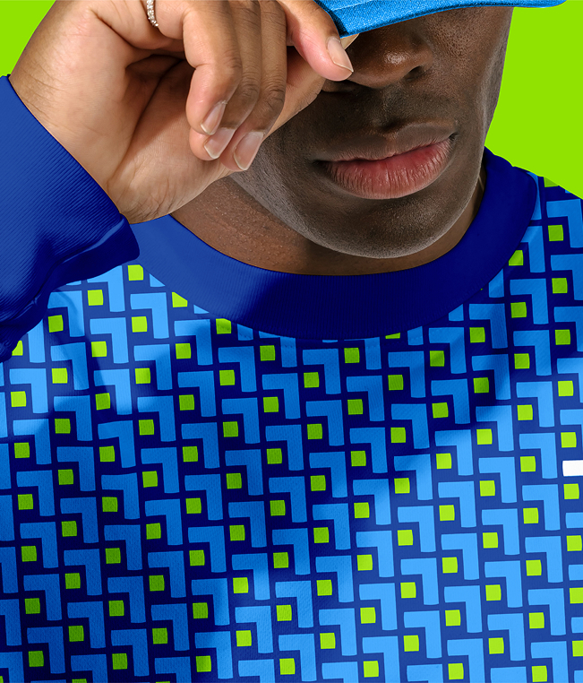
An illustration system built to flex
Built from Telkom’s typographic foundations and photographic language, illustration breaks type into bold geometric forms. A flexible system that uses perspective, colour, and simplicity to add energy, meaning, and optimism to everyday moments.


A brand designed to be heard
Rooted in the *180# dial string, Telkom’s sonic identity expands from a distinctive mnemonic into a full sound library and brand soundtrack. Recognisable, memorable, and uniquely Telkom.
An intentional graphic language
Inspired by the SIM card, Telkom’s graphic language uses clean geometry and chamfered edges to create clarity and consistency. It supports navigation and recognition across digital, retail, and product environments.


“The refreshed brand identity is modern, relevant, and distinctly Telkom – a reflection of the thoughtful process and passion the Murmur team brought to every interaction.”
Almé Cunningham, Telkom Brand