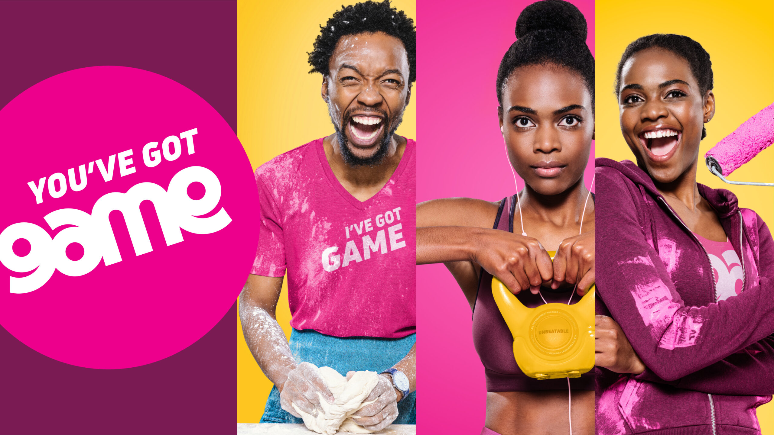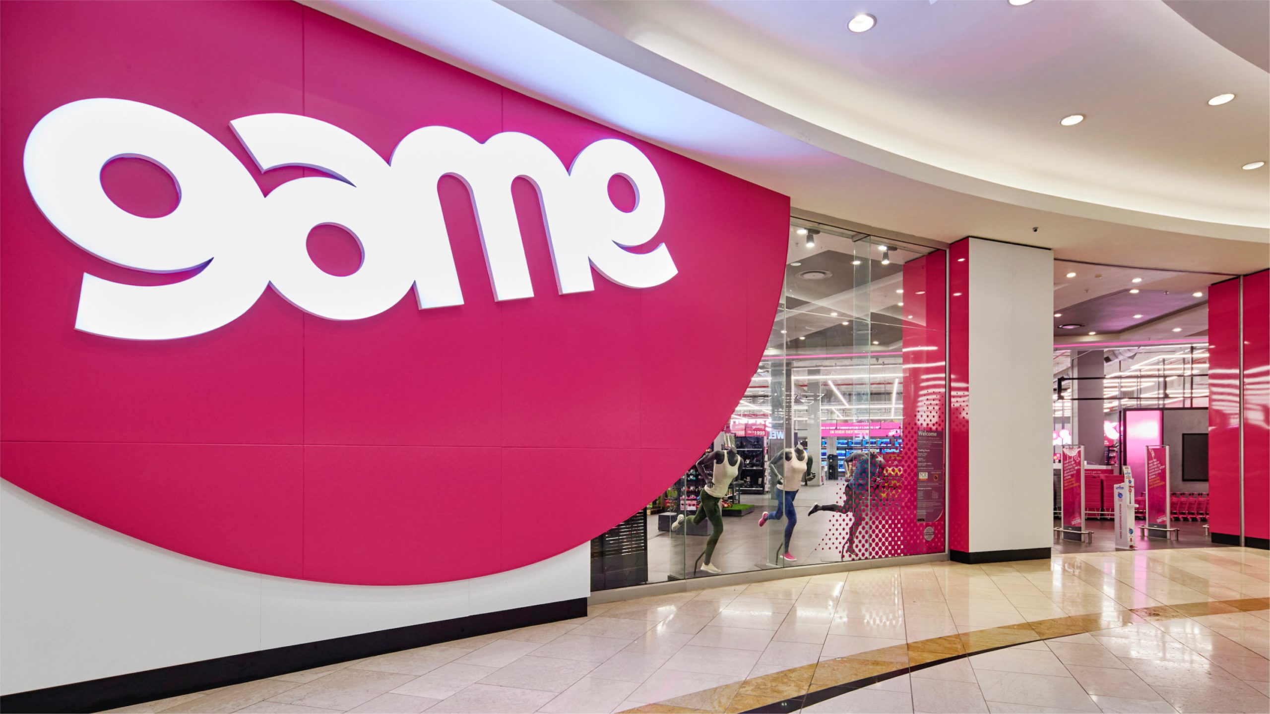
Rebranding South Africa’s largest discount retailer to show that, after all these years, they’ve still got Game!
Sector
Retail
Our value
Brand identity
Digital Design
In-store
Above the Line
Below the Line
Digital Design
In-store
Above the Line
Below the Line
The Challenge
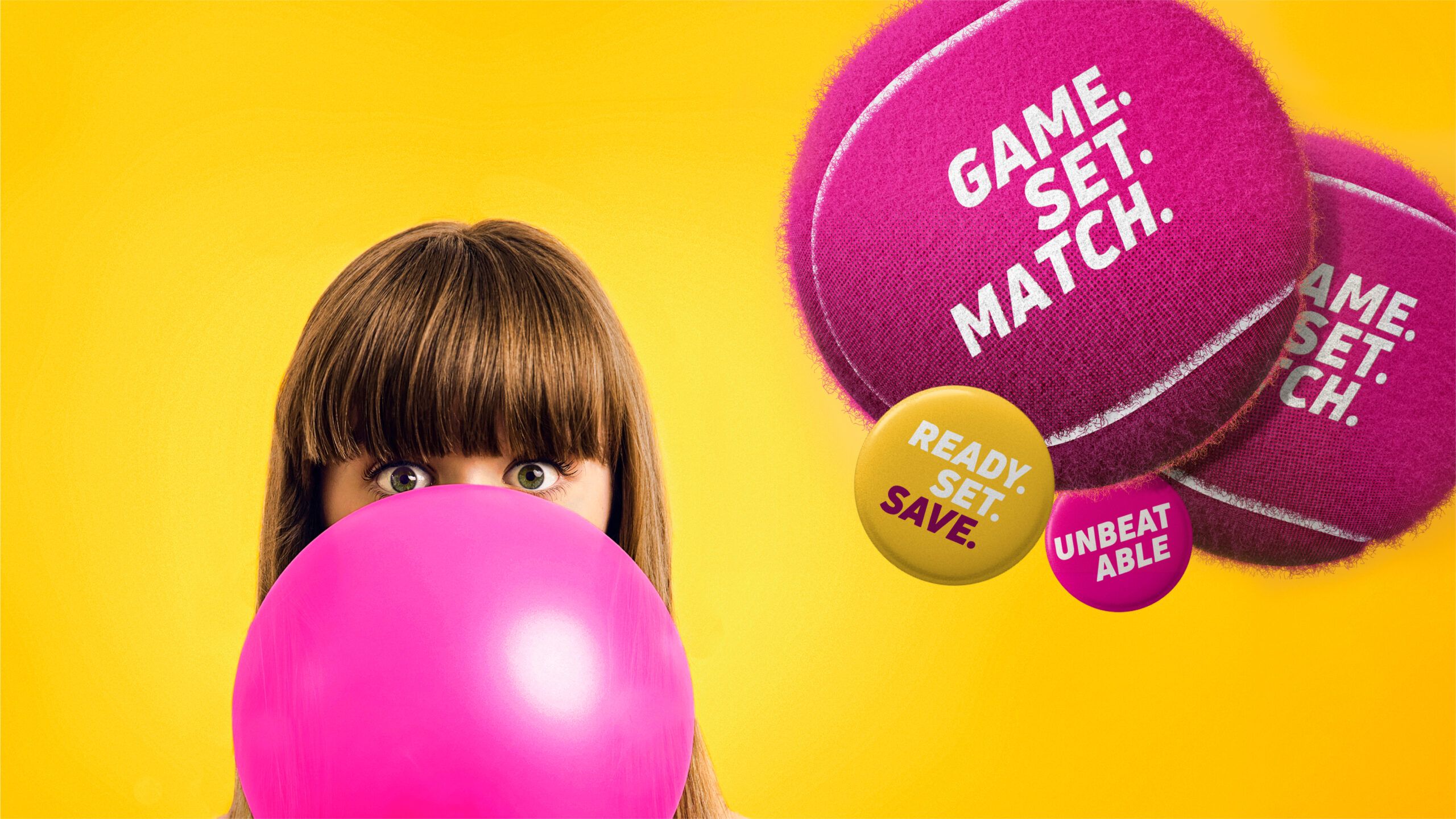
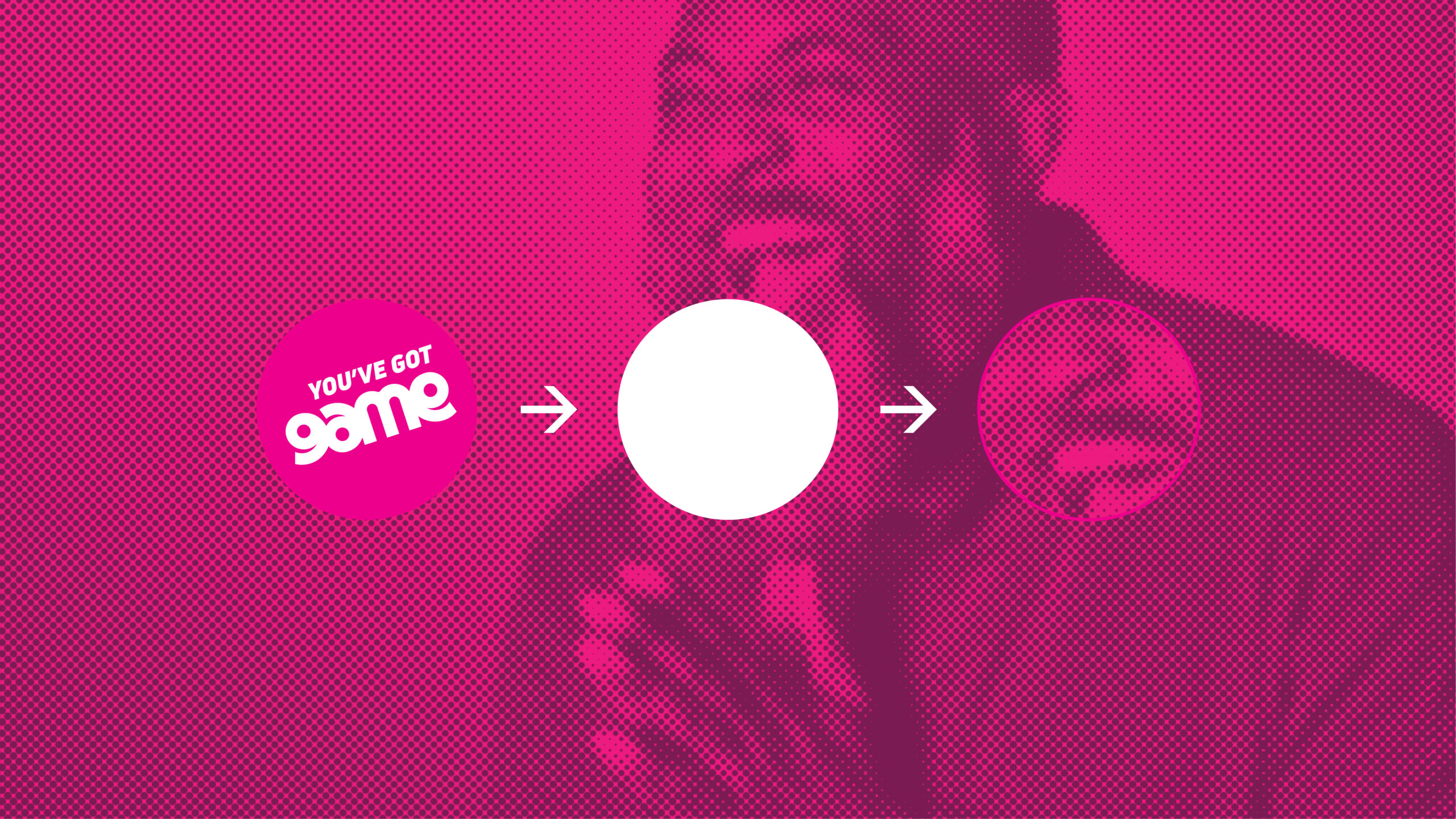
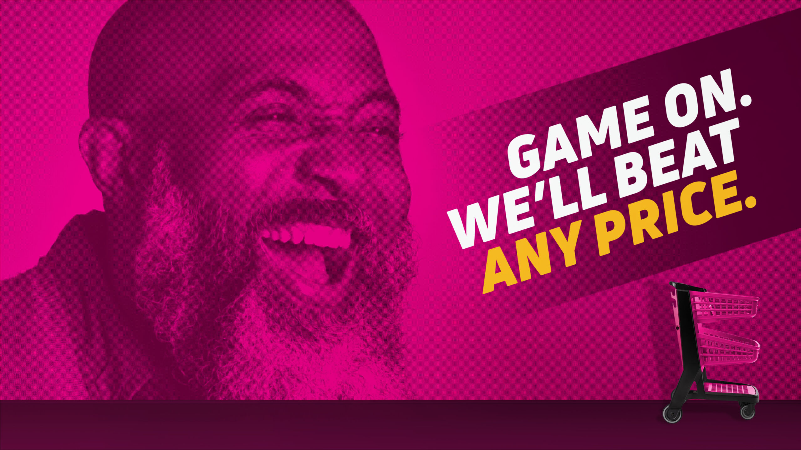
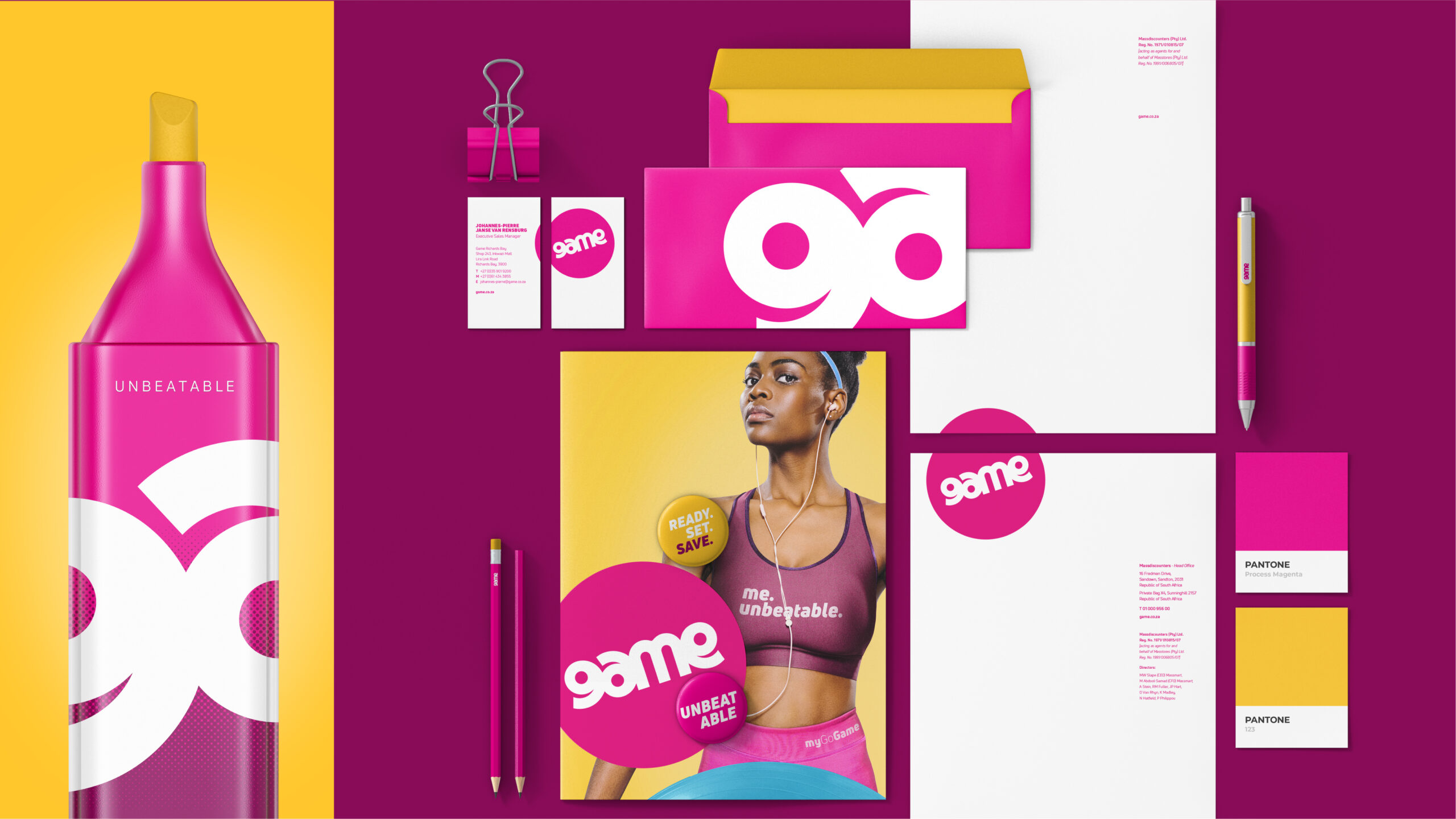
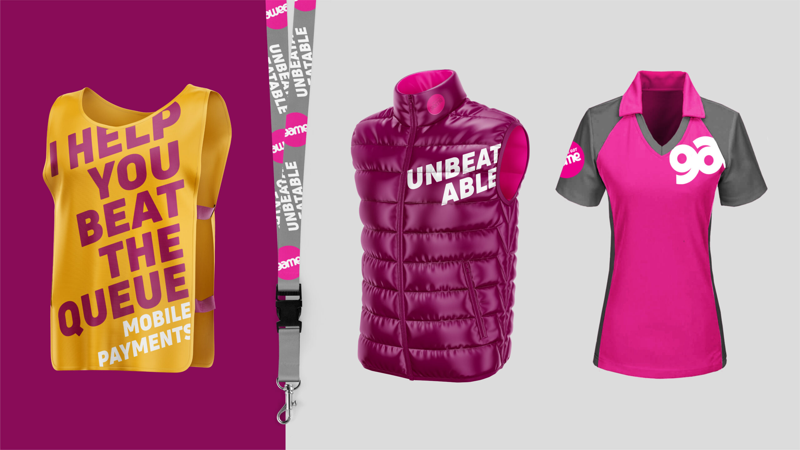
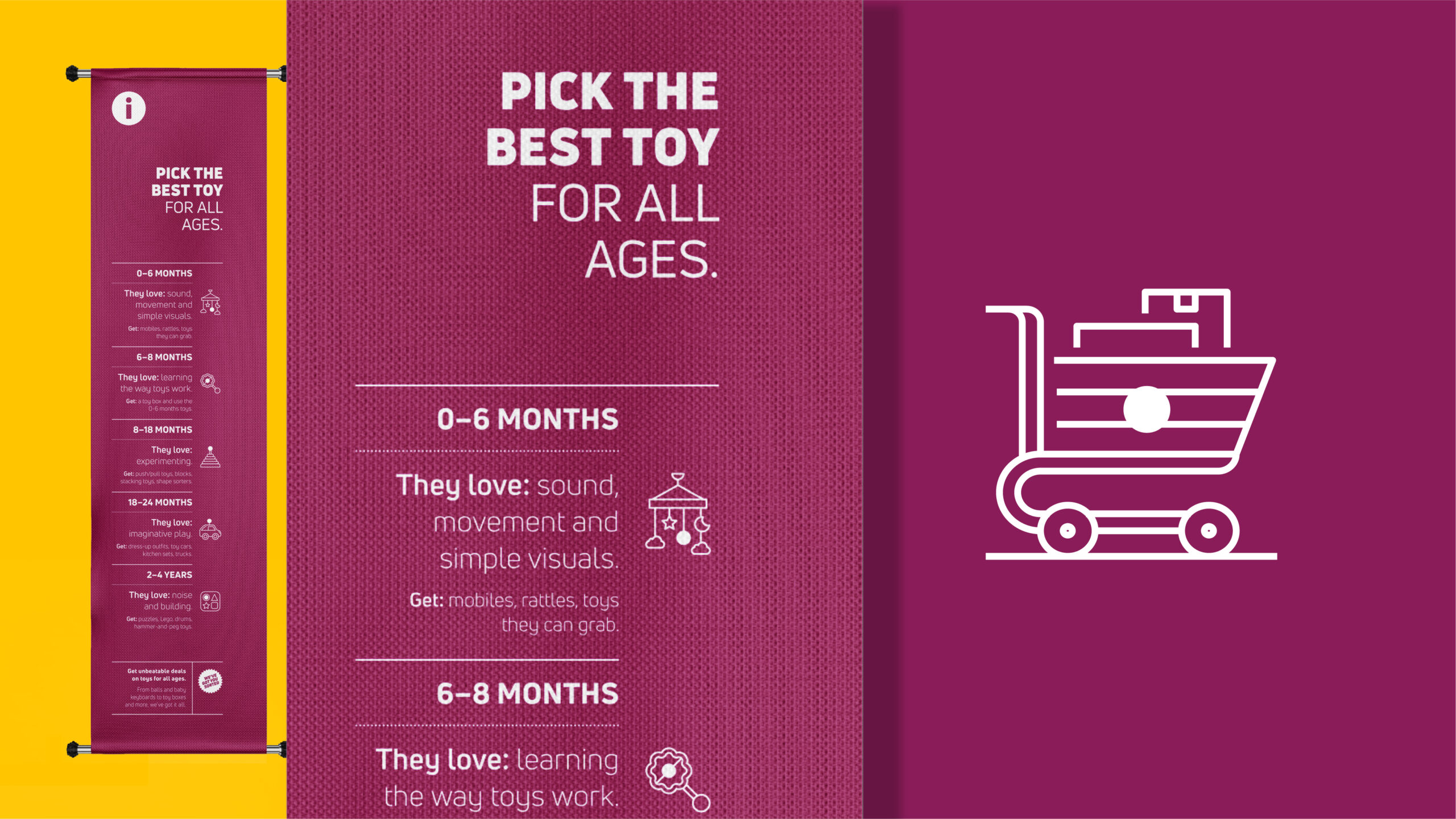
After 50 years of leading South Africa’s discount retail section, the Game brand had become synonymous with great value. But the brand itself had grown over time to speak to a very different target audience. A fresh, exciting and almost “edgy” visual language was required to position the brand to a younger audience. The visual language was built around a simple dot, but brought to life using half-tone patterns and graphic applications that had the dot as a focal point. The brand was rolled out across digital, physical and in-store platforms, including a full redesign of the in-store experience.