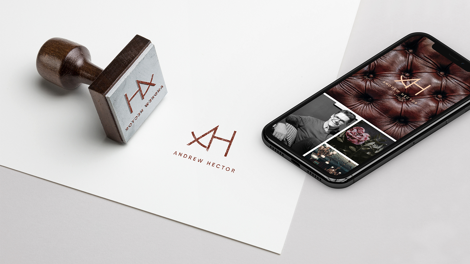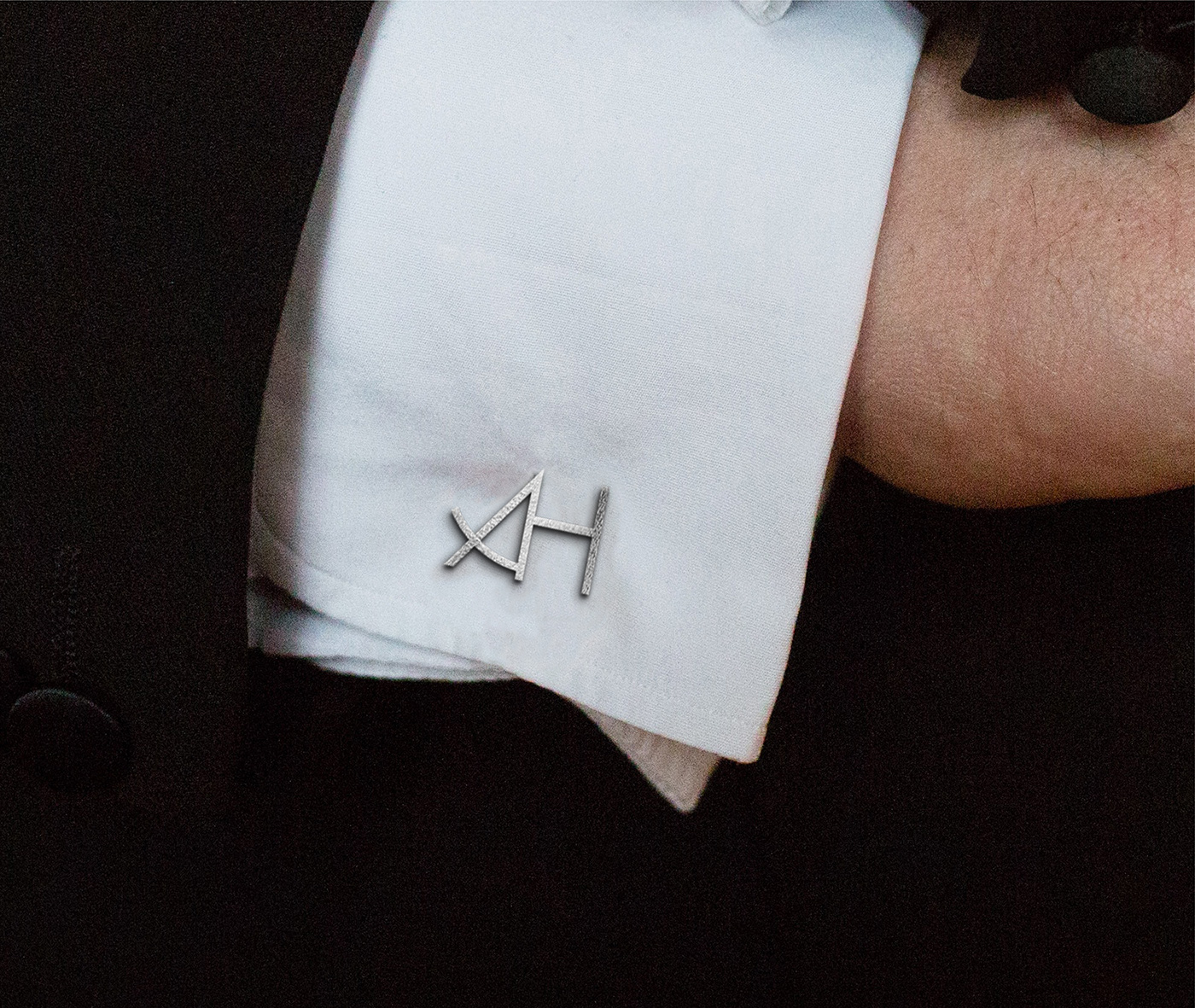
Reflecting the strive for excellence using one of the oldest principles of design in a fresh and elegant way.
Sector
Interior & tableware design
Our value
Brand strategy
Brand architecture
Brand identity
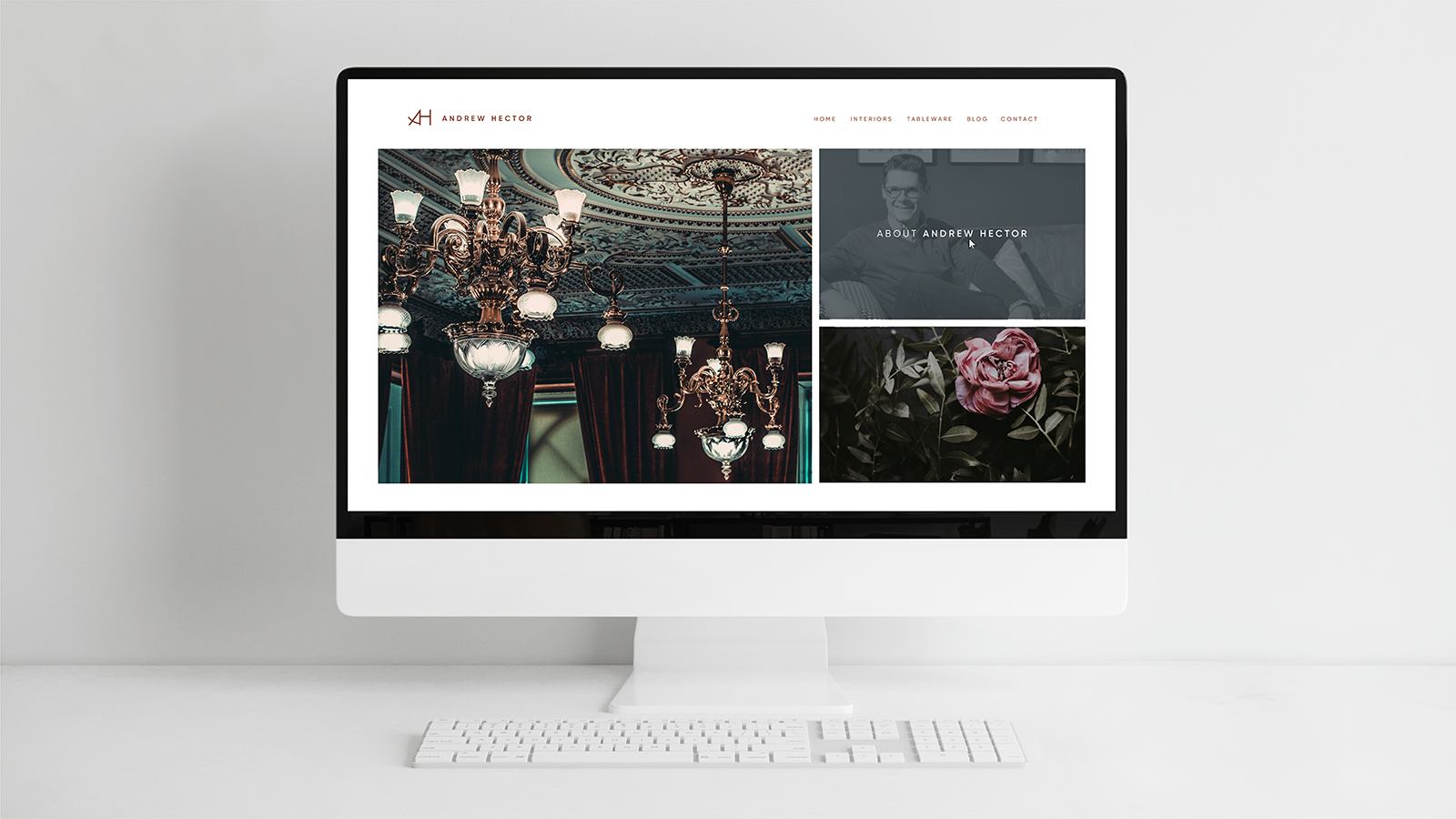
Web design
Brand architecture
Brand identity
Web design
The Challenge
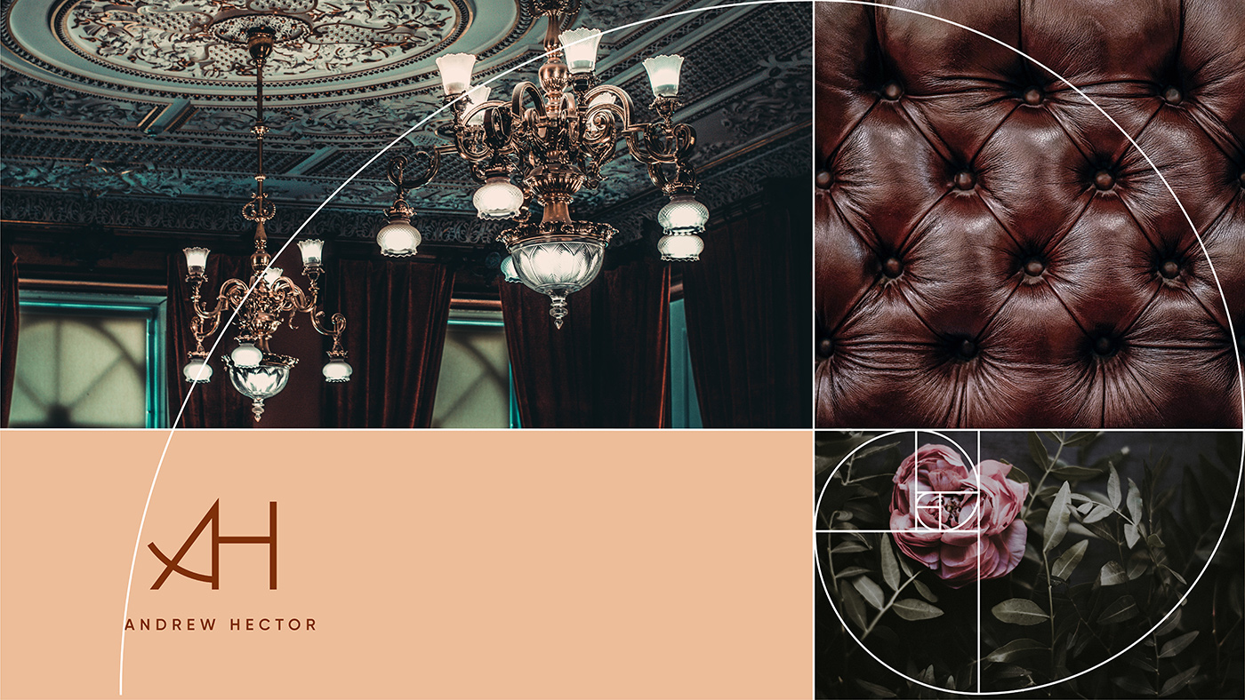
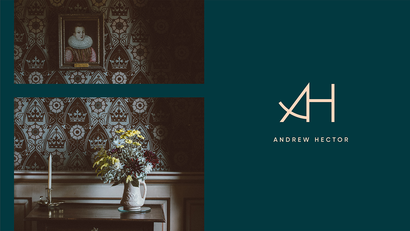
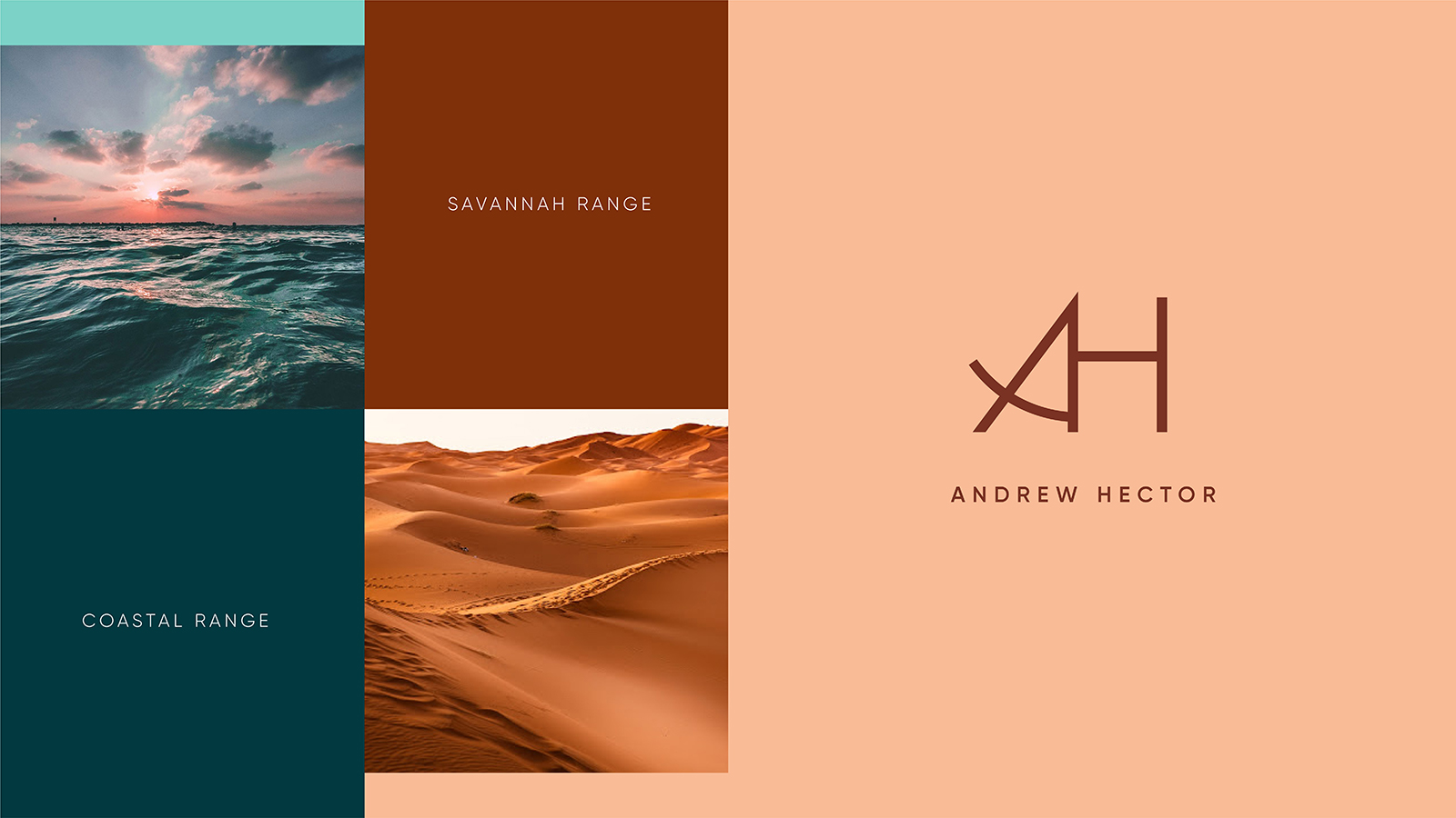
The Andrew Hector brand focuses in space planning, thus finding the right balance between elements is of utmost importance. Similarly, the brand needed to strike a balance between timeless elegance, and contemporary craft to show Andrew Hector’s constact strive for excellence and understated extravagance. The golden mean was used as the basis of the monogram, and also informed the visual language. All layouts are designed using the golden mean, with imagery reflecting scenes of interiors, antiques and textures. Printing was done using metallic foils to add that touch of class to the execution.